Survival Kit Collective:
Arcosantian economics, Biospherian aesthetics:
by the Survival Kit Collective / Joy Elaine Denett, Nina Dubois, Catherine Harris, Ryan Henel
Collective:
Survival Kit Collective is a flexible structure set up by the UNM art and ecology area to house a core group and visiting members. In the 2011 iteration, we met under a course title, “DIY infrastructure”. SK2011 moved to a more fluid field of backyards and residential fields of intervention. SK2011 took on the re-use of materials and the application of DIY ethics that have fallen out of favor with cheap manufactured goods and learned helplessness.
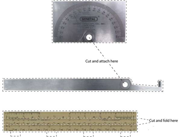
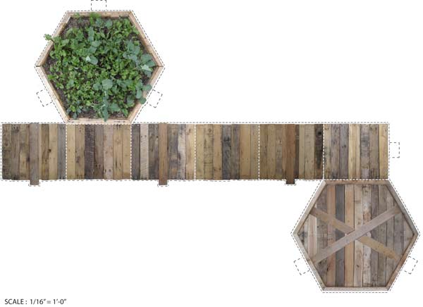
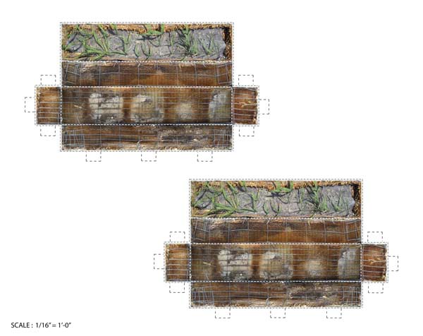
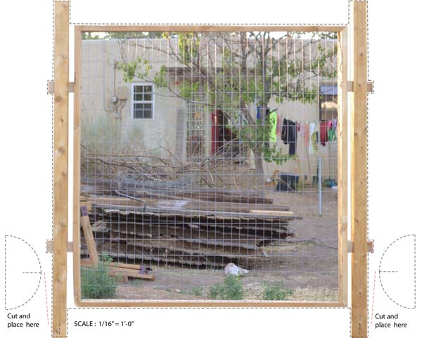
The cut-out fold and tab paper models included here, represent the projects that SK2011 undertook. We encourage you to use the models throughout this essay and scaling tools to inspire your own backyard explorations.

scaling tool- click on image to download pdf.
To ground our backyard experiments in a larger contextual framework, SK2011 investigated regional utopian models – Arcosanti and the Biosphere. Visiting the Biosphere in February of 2011, SK2011 encountered a conglomeration of a commercial business, a theater troupe, and a deeply concerned environmental ethic powered by a massive diesel generator hidden by an Islamic and pre-Columbian architectural mash-up. Our stay only deepened the sense of contradictions. Biosphere seemed alternately completely generous as an institution yet staffed by tour guides with chips on their shoulders presenting the scientists as victims of the media frenzy generated by their profit seeking funders. The economics of building a project with a single vision and unlimited funds permeated Biosphere. Biosphere requires huge gifts of cash for universities to take it on as a research facility each time it changes hands, A subsequent visit in September, 2011, proved the tour changed as ownership changed. The tour now focuses on current research by the University of Arizona and cost saving measures they implemented. Both times we admired the engineering with two lung buildings that expand and contract, regulating the interior air pressure in response to the Sonoran desert temperature fluctuations. Passing through the industrial age's hidden infrastructure for the ecosystems underneath the massive greenhouses was a sobering prediction of Metropolis infused images of life in a future. Its cool winds and booming echo were created by a simple and universal ritual form of kivas, domes, and amphitheaters.
Arcosanti seemed almost opposite in its utopian vision. The settlement is built from incremental infusions of cash and individual enterprise, dictated by Paolo Soleri and the leaders of the community. The site is one-tenth the size of the vision and seems stable in its population and resources. Instead of requiring gifts of money to keep it afloat, residents learn to make bronze and ceramic bells sold in a traditional arts and crafts mode. Spaces are small and public space is difficult to differentiate from private, though it is sparsely populated. The iconic architecture also borrows from earlier forms, using a deeply ingrained circle in the square motif, apse arches and vertical stacking of cubes, evoking Palladian villas and Roman ruins translated through modernist formalism.
Arcosantian economics, Biospherian aesthetics: The non-dimensional planter boxes.
The first project that SK2011took on was the creation of a raised-bed garden at the heart of the University of New Mexico's student ghetto. Three dwellings - two apartments and a casita, open on to a large, common yard. Here, there is no soil to speak of, the owners having chosen to go the route of no-maintenance landscaping. Two concrete parking pads grace sides of the casita, the large northern sector, is entirely covered in gravel, and to the south, a covered porch faces a semi-enclosed area with a few trees and a ground cover of bark mulch. Recent memories of organic farming and daily consumption of fresh produce motivated the casita resident to begin a collective garden area, and with the help of her SK2011 collaborators, to transform this urban desert into an oasis.

Hexagonal planter model- click on image to download pdf.
It was decided that one of the parking pads could be given up for the raised bed garden. The parking pad on the east side of the casita will remain open, as it provides a great outdoor working space. A commitment to DIY ethics and strategies guided the project from the start, using locally available, preferably free and/or recycled materials. The project grew from a previous construction, an opportunity to recycle leftover materials and revisit some previously explored conceptual and aesthetic terrain. The casita-dweller, a compulsive builder, had previously constructed a geodesic dome from shipping pallets – part homage, part critique, and part appropriation of utopian modernist architecture.
The process involved cutting existing pallets into hexagonal and pentagonal shapes and re-building the edges with short lengths of the 2x4s from pre-existing pallets. A local recycler supplied the necessary, standard 40” x 48” pallets as well as large stacks of bulk component parts. Piles of these materials had been left over from building the dome. And while some of the wood made its way into furniture, compost bins and other backyard projects, barely a dent had been made in the towering piles of lumber.
Why the hexagon? – It tessellates and can be reoriented in a number of ways. The hexagon forms the basis of many crystalline forms in nature, such as snowflakes and clay molecules. It is incredibly space-efficient – having the highest contained area to perimeter ratio after the circle. Honey bees use hexagons to make their combs because they want to enclose the largest possible space with the least amount of wax. Early adopters of the modernist tenets of “Form follows function”, “Truth to materials”, and “Simplicity and clarity of forms”, bees have demonstrated that efficient, elegant design is possible with even the greatest economy of means. And here is where the two models meet; Arcosanti employs the hive’s local labor and resource-based economy while Biosphere is an expression of the simple, repeating geometric patterning of hive architecture.
Bees also embody the idea that life is work, and that the structures that sustain us require constant maintenance. Often a burden, another understanding of work might bring us into a mode of shared intimacy with the world. The SK2011 team met twice a week , cutting the wood down into standard building units, pulling nails, stuffing the walls of the boxes with straw insulation. At the end of two weeks, six weathered wood honeycomb boxes graced the once featureless concrete plain, animating the space and setting the stage for new growth.
Arcosantian design, but nobody’s home
SK2011 expanded the working framework from backyard to alley. The student ghetto is criss-crossed by a system of alleyways that serve as access to homes, utilities and trash removal. They are unpaved and attract garbage and weeds. Property owners maintain these spaces, but they act as community space. Urban chickens hop the fence, people walk dogs, people without homes seek shelter, drunk people argue…

carpet/chickenwire planter- click on image to download pdf.
On the alley stage, the afternoon sun bakes the casita wall. The dumpster sits at the casita edge. The casita backyard, where building materials are mined: an weathered rug, pig fencing, wood, hinged scaffolding, and a can of discarded white paint. A ghost of member J’s dead dog patrols the yard. During SK2011’s spring projects, the dog house moved and becomes a chicken coop for member N’s yard. Another actor, the landlord determines the temporary nature of any intervention for member J.
Instigated by member J, SK2011 built a green wall out of recycled materials mainly to provide a buffer from the afternoon sun, to tend the alley and to discourage vandalism and littering.
Sk2011 builds a basket-stepped wire fencing and cut-carpet strip framework, The baskets are filled with soil and grass seeds planted .
As we observed at Arcosanti, projects that are tended by continuous inputs of human labor thrive. The green wall is an example of latent potential. Member J has moved to Portland, OR. The soil-filled units will continue to provide sun-mitigation, but without watering, the green, planted elements are unlikely to survive.
Biospherian Economics, Arcospherian Design Precedents: The Dividing Fence:
For member C, SK2011 built a dividing fence, a “good fence” This utilitarian fence proposed two functions, united to frustrate one vector, or actor, in the backyard.
A backyard can be understood as the sum of its actors and the boundaries it defines. In this case the backyard contains two children, 6 and 2, two parents, and a dog. The cat is un-contained and transcends fences, property, and propriety. The west fence, also is a porous boundary. Newly built by a neighbor, it represents the best in PhD fence building. Each slat carefully selected from the piles at Home Depot, each post concreted into the ground. This fence only slightly contains the enthusiasm of the girl child on the west side for playing with the girl in the backyard.

Fence Outline- click on image to download pdf.
The four-year-old dog dominates the backyard he runs the boundaries and barks to the annoyance of all. This behavior is magnified by the man who lives in the back casita of a house . He feeds the dog soup bones. The dog attacks the PhD fence in search for more. The dog is, at home, a reluctant vegetarian.
The two children use the backyard most often. They swing on swings from the trees, set up kiddie pool play that turns into mud swamp play, and watch ants by the hours.
The adults hope for redemption from the backyard. They daydream about gardens and self-sufficiency in the face of dry dust, concrete projects abandoned by the prior owner, and minimal of money and time.
A 75 mph wind knocked down the side fences, shredding the suburban fabric and releasing the dog to run freely, motivating a fence building extravaganza.
As built by SK2011, the utilitarian fence extends from the north at the corner of the sandbox, and, at an angle, arrives at the south side, incorporates an existing metal gate. Flagstone from the attempted patio at the western side of the house forms a base the dog can’t dig under or push through. The stones are lag bolted to the fence posts. The modular 6’ x 6’ square panels are made of 2x4 wood frames with wire fencing.
The fence itself provides a site for Eden. It excludes the dog, both from a future garden area and from the fences he attacks.
Arcosanti’s ethos directs the aesthetics – squares, modernist design mingled with found materials and practicality. Biospherian economics is the rule however, on this project. The project needed money thrown at it, as SK2011 wasn’t able to remove the existing concrete and some of the needed materials were bought at big box and local retailers.